
نهر (طباعة)
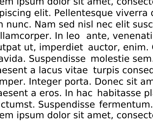
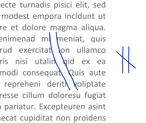
في فن الطباعة، تُعرف "الأنهار" (أو " أنهار البياض" ) بأنها فجوات في النص تبدو وكأنها تخترق فقرة كاملة نتيجة لتطابق المسافات. [ 1 ] [ 2 ] [ 3 ] [ 4 ] [ 5 ] [ 6 ] قد تظهر هذه الأنهار بغض النظر عن إعدادات التباعد، ولكنها تكون أكثر وضوحًا مع المسافات الواسعة بين الكلمات الناتجة عن ضبط النص بالكامل أو استخدام الخطوط أحادية المسافة . تكون الأنهار أقل وضوحًا مع الخطوط المتناسبة نظرًا لضيق المسافات. ومن الأسباب الأخرى لظهور الأنهار تكرار كلمة طويلة أو كلمات متشابهة بشكل متقارب على فترات منتظمة، مثل "maximization" مع "minimization" أو "optimization".
تظهر ظاهرة "الأنهار" نتيجةً لتضافر عدة عوامل، منها ارتفاع حرف "x" في نوع الخط، والقيم المُخصصة لعرض الأحرف المختلفة (سواءً كان الخط عريضًا أم نحيفًا)، ودرجة التحكم في تباعد الأحرف والكلمات. وتكون الخطوط العريضة أكثر عرضةً لظهور هذه الظاهرة، وكذلك تطبيقات الطباعة الأقل تطورًا التي لا توفر تحكمًا كبيرًا في التباعد. كما أن زيادة تباعد الجمل قد تُفاقم هذه الظاهرة. أما تطبيقات الطباعة الأكثر تطورًا، فتقسم الأحرف الفردية إلى أعداد أكبر، مما يُتيح تحكمًا رقميًا أدق. كما أنها توفر مكتبات أشمل من "أزواج التباعد" التي تُحدد مقدار المسافة المسموح بها بين جميع التوليفات الممكنة لأزواج الأحرف.
يسعى مصممو الخطوط إلى تقليل أو إزالة تأثير التداخل بين الأحرف. في كتابه " نقاط دقيقة في تباعد الأحرف وترتيبها" ، يشرح مصمم الخطوط الكندي جيفري داودينغ ذلك على النحو التالي.
A carefully composed text page appears as an orderly series of strips of black separated by horizontal channels of white space. Conversely, in a slovenly setting the tendency is for the page to appear as a grey and muddled pattern of isolated spats, this effect being caused by the over-widely separated words. The normal, easy, left-to-right movement of the eye is slowed simply because of this separation; further, the short letters and serifs are unable to discharge an important function—that of keeping the eye on "the line". The eye also tends to be confused by a feeling of vertical emphasis, that is, an up & down movement, induced by the relative isolation of the words & consequent insistence of the ascending and descending letters. This movement is further emphasized by those "rivers" of white which are the inseparable & ugly accompaniment of all carelessly set text matter.[7]
Typographers can test for rivers by turning a proof sheet upside down (top to bottom) to examine the text. From this perspective, the eye is less likely to recognize words and the type can be viewed more readily as an overall pattern.
Other related terms are lakes and holes, which refer to a cluster of adjacent or intertwined rivers that create a lighter area within a block of type.[8][9][10]
See also
Notes
- ↑Dowding 1995. p. 29.
- ↑Felici 2003. p. 80.
- ↑Fogarty 2008. p. 85.
- ↑Schriver 1997. 270.
- ↑Smith 2009.
- ↑Squire 2006. p. 65.
- ↑Dowding 1995. pp. 5–6, 29.
- ↑Garner 2006.
- ↑Jury 2009. p. 58.
- ↑Williams 2003. p. 13.
References
- Dowding, Geoffrey (1995). Finer Points in the Spacing & Arrangement of Type (Revised ed.). Vancouver, BC: Hartley & Marks Publishers. 90. ISBN 0-88179-119-9.
- Felici, James (2003). The Complete Manual of Typography. Berkeley, CA: Peachpit Press. 384. ISBN 0-321-12730-7.
- Fogarty, Mignon (2008). Grammar Girl's Quick and Dirty Tips for Better Writing. New York: Holt Paperbacks. 240. ISBN 978-0-8050-8831-1.
- Garner, Bryan A.; Jeff Newman; Tiger Jackson (2006). The Redbook: A Manual on Legal Style (2nd ed.). Thompson West. 1008. ISBN 978-0-314-16891-7.
- Jury, David (2009). "What is Typography?"(PDF). Rotovision. pp. 28–87. Archived from the original(PDF) on 15 July 2011. Retrieved 31 March 2010.
- Schriver, Karen A. (1997). Dynamics in Document Design. New York, Chichester, Brisbane, Toronto, Singapore, Weinheim: John Wiley & Sons. 592. ISBN 0-471-30636-3.
- Smith, Laurie (8 July 2009). "Don't Date Yourself by Using Two Spaces after a Period in Your Resume!". Executive Resumes and Career Transition Strategies: Reflections of an Executive Resume Writer. Creative Keystrokes Executive Resume Service. Archived from the original on 10 July 2011. Retrieved 30 March 2010.
- Squire, Victoria; Willberg, Hans Peter; Forsmann, Friedrich (2006). Getting it Right with Type. London: Laurence King Publishing. 176. ISBN 978-1-85669-474-2.
- Williams, Robin (2003). The Mac is Not a Typewriter: A Style Manual for Creating Professional-level Type on Your Macintosh (2nd ed.). Berkeley, CA: Peachpit Press. 96. ISBN 0-201-78263-4.
- Typography